YouTube thumbnail audit
What a YouTube thumbnail audit should include before you redesign anything.
A thumbnail audit is not just picking brighter colors. The useful version explains what the viewer understands in one second, what the title adds, and what should be tested next.
Start with the promise
Every thumbnail should answer a simple question: why should this person stop scrolling now? The answer may be a problem, a result, a contrast, a deadline, a mistake, or a curiosity gap. If that promise is unclear, better rendering will not fix the packaging.
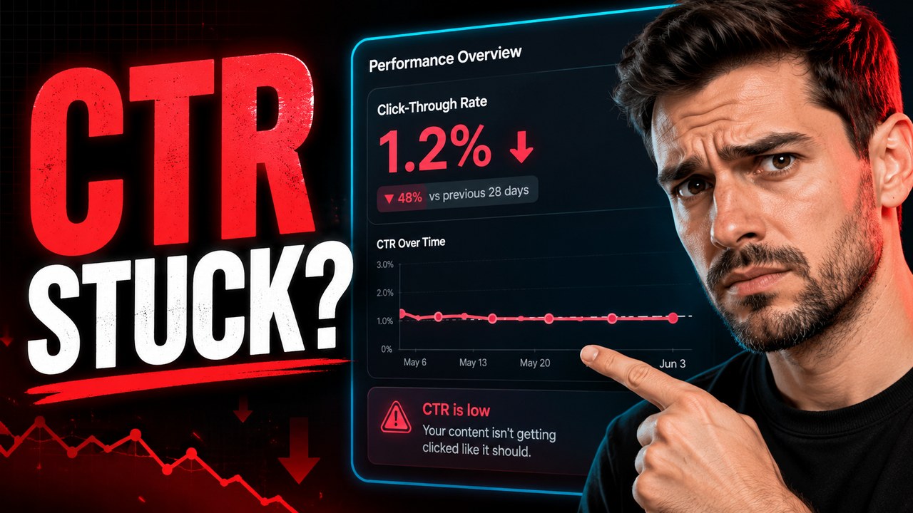
Check mobile readability
Most thumbnails need to work at small size. Text should be short, faces or objects should be recognizable, and the main contrast should survive when the image is compressed in a feed.
Pair the title and thumbnail
The thumbnail and title should not say the exact same thing. The thumbnail should create fast recognition or tension. The title should add specificity. Together they should make the video feel easier to understand and more worth opening.
Audit against the feed
A good thumbnail may still disappear if every competing video uses the same colors, expressions, and layout. A useful audit checks whether the design is distinct enough for the actual topic and audience.
What Northline Content Lab gives you
- What the current thumbnail communicates in one second.
- Where readability, contrast, title pairing, or topic clarity is weak.
- Three replacement directions with different hooks and visual systems.
- Notes on what to test next without promising guaranteed CTR, views, or revenue.